


Marimekko charts are a type of infographic that’s ideal for displaying categorical sample data. They’re also known as mosaic plots or Mekko charts. But what is a Marimekko chart?
Today, we’ll examine these charts, their benefits, and even how to make one. Keep reading to learn all you need to know about Mekko charts.
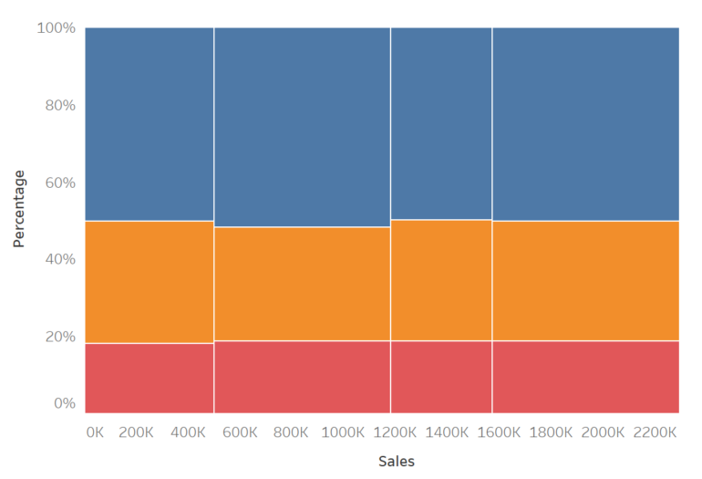
What Are Mekko Charts?
A Marimekko chart is a graphical representation that uses stacked bar graphs of varying widths to visualize categorical data. The height of each bar corresponds to the total number of observations in that category, while the width of each bar corresponds to the proportion of observations in that category.
Marimekko charts are especially useful for visualizing how different categories are related to each other. For example, you could use a Marimekko chart to compare the proportions of men and women in different age groups.
Common Use Cases for Marimekko Charts
There are many different ways that businesses can use Marimekko charts to improve their operations. In this section, we’ll explore some of the most common use cases.
Marimekko charts are perfect for analyzing sales data. You can use them to track sales trends over time, identify seasonal patterns, and identify any spikes or drops in sales. This information can help you make better business decisions and optimize your sales strategies.
You can also use Marimekko charts to analyze customer data. For example, you can use them to track customer demographics, track customer spending habits, or identify customer loyalty patterns. This information can help you better understand your customers and create more effective marketing campaigns.
These charts also work well for analyzing product data. For example, you can use them to track product sales over time, identify popular products, or track product margins. This information can help you make better product decisions and improve your product line.

Finally, Mekko charts can be used to track project progress. For example, you can use them to track the progress of individual tasks, track the progress of a project over time, or track the budget for a project. This information can help you stay on track and ensure that your projects are on schedule.
How To Create a Mekko Chart in Excel

Creating a Marimekko chart in Microsoft Excel is a great way to visualize your data. It can be used to compare two or more variables, or to compare groups of data. The mosaic plot will show how the data is distributed, and it can be used to identify any outliers.
To create a Mekko chart in Microsoft Excel, you’ll first need to gather your data. The data should be in a table, with each column representing a different variable. You’ll then need to create a scatter plot of the data.
To create a scatter plot, select the data that you want to plot and then click on the Insert tab. In the Charts group, select the Scatter icon. Excel will create a default scatter plot, but you will need to change the type of plot to a mosaic plot. To do this, right-click on the plot and select Change Series Chart Type. In the Change Series Chart Type window, select the mosaic plot and then click OK.
Excel will create a Marimekko chart of your data. The plot will show how the data is distributed, and it will identify any outliers.
Making the Most of Mosaic Plots
Marimekko charts are important because they’re graphical representations of how categorical data is distributed. These useful data visualization tools offer numerous uses, such as analyzing customer, sales, and product data. Furthermore, they’re exceedingly easy to create in Excel. So, consider visualizing your business data using a Marimekko chart.