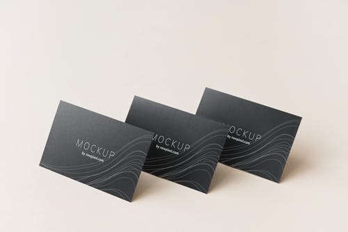
Doing business is equal to meeting new people and establishing network. One of the networking activities is exchanging business cards. In this situation, you should avoid handing potential clients with dull and boring business cards. Some marketers even hand people frayed and torn cards. You also fail to make a good first impression if your business card has outdated contact information and you need to write down scribbled corrections. It is important for you to design a business card that you are proud of. The goal is to make the information available to potential clients, so they can contact you anytime. After distributing hundreds of business cards in trade events and other business-related activities, you can start to generate a lot of sales and orders.
When designing business cards, you should avoid using white, plain card stock. This will make your business cards look dull and boring. Avoid using thermograph printing or raised printing, because it is generally considered as old fashioned these days. If you want to use shiny coating, you should apply that only on one side of the card. This will allow people to write any additional information on the card. Make sure that you put at least three methods of communicating with you. Phone number should be the primary method, followed by email and instant messaging. Don’t forget to provide accurate information about your mailing address as well. You can also drive traffic to your website, but putting the address of your website.
These days, people don’t use fax too often. They could simply send documents through email and get it printed right away. If you don’t use fax regularly anymore, you shouldn’t include that information in business cards. Avoid putting too much information in your business cards. It won’t make a good impression if your business cards have crowded design, because people will think that you are less organized. You can better improve awareness to your brand by using unique design. Even so, you should always try to make your business cards look perfectly simple. White space is also an important part of the design. Use fonts that allow people to get important information, just by taking a glance of your card. Don’t use all caps, because this can make your cards look intrusive.
If your business is based on building relationships and providing consultancy, it is a good idea to put your photograph on the card. This will make you to become more memorable. Make sure that the card perfectly fits who you are. If you are an artist, make sure that the card has a great artistic feel. If you are a consultant, make sure that your card gives a professional appearance. Your logo should be memorable and visually appealing. If possible use four colors for your business cards to them look appealing. When you give the card to a prospect, make sure that you give it face up to encourage the person to inspect your card. Distribute as many cards as possible, to increase the chance of making sales.
